Have you ever launched a holiday campaign only to find your printed catalog’s branded blue looking more like sea foam than sapphire? You double-check files, mockups, and approvals, yet the final colors feel disappointingly off. If you’re selling personalized photo products at scale, these inconsistencies can chip away at customer trust and strain your operations. That’s where understanding ‘what is CMYK’ becomes more than a technical detail—it becomes a strategic advantage.
In the world of personalization and mass customization, color accuracy isn’t just a ‘nice-to-have’ – it’s central to the customer experience and operational efficiency. Whether you’re orchestrating automated workflows or managing templates across multiple regions, printing in CMYK isn’t just about hues on paper. It’s the backbone for quality, consistency, and scale in physical product output.
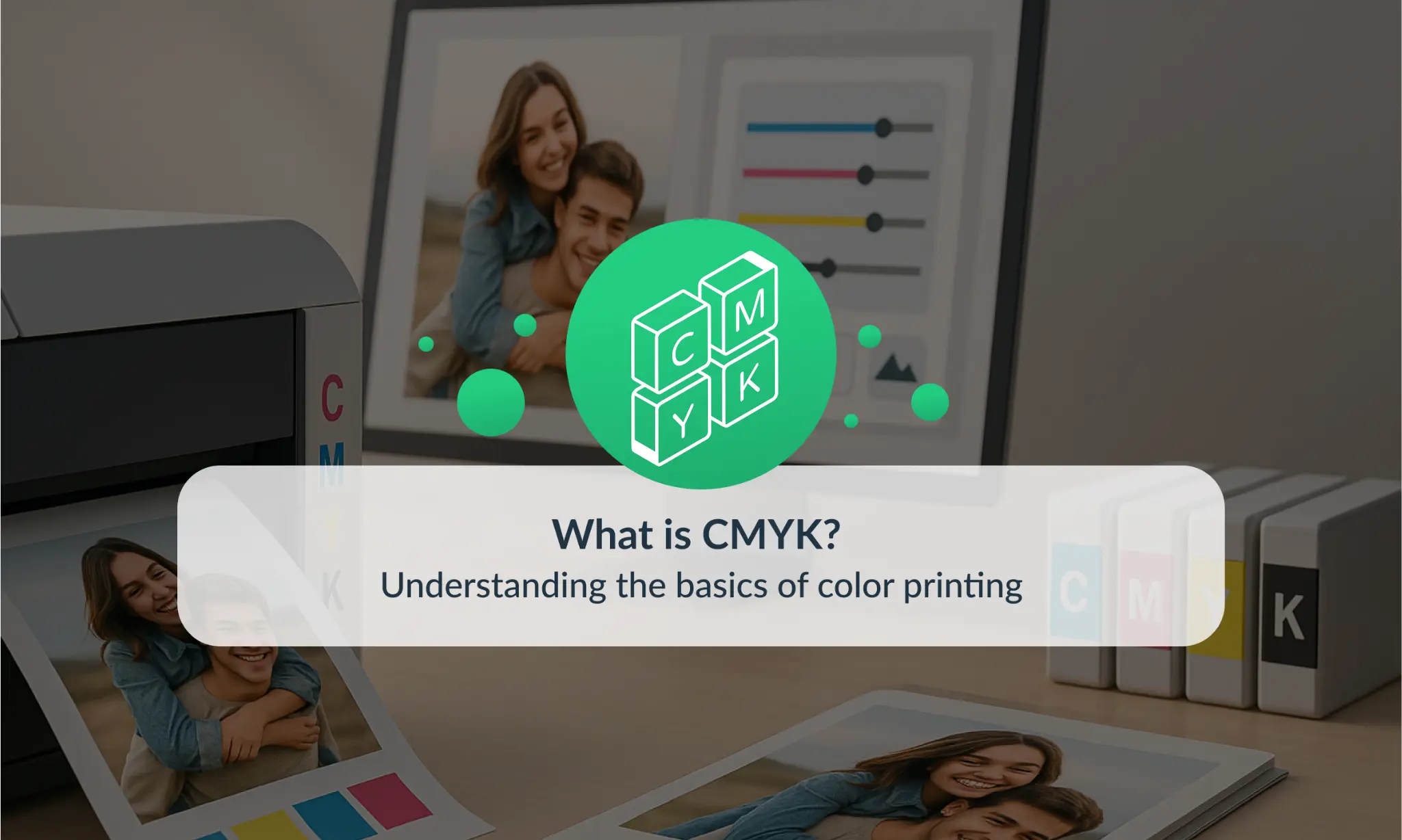
How Does CMYK Work?
To start with the basics, what does CMYK stand for? It’s an acronym for Cyan, Magenta, Yellow, and Key (Black)—the four ink colors used in most commercial printing processes. Unlike RGB, which is an additive color model used for screens, CMYK is subtractive. That means colors are created by subtracting varying percentages of light reflected off the surface, layering inks to build the final shade.
So, what is CMYK doing in a SaaS-driven print operation? Quite a lot:
💡 Printbox Insight
Every image and product you print goes through some form of pre-press processing. At the enterprise level, this includes embedding ICC profiles—standardized color settings used to ensure devices interpret and reproduce color data consistently. Without ICC profiles, your vibrant orange wedding album cover might turn into a muted brown mess.
Another layer is soft proofing—previewing what the final printed version will look like using a reliable monitor setup. Combine that with cloud-based platforms, and color management becomes not just a quality measure but an operational requirement for printing at scale.
💡 Printbox Insight
For teams working in cloud-based platforms, it helps to have one place where you can keep an eye on everything — especially color. Modern SaaS tools let you set up automatic checks, flag inconsistencies, and make sure your printed products actually match what your designers intended. It’s one of those things that saves headaches before they happen.
RGB vs CMYK: Key Differences
Many product teams make the mistake of designing in RGB without realizing the downstream consequences in print. RGB – short for Red, Green, Blue – works by emitting light, making colors more vibrant and ideal for screens. But printers can’t reproduce the full RGB spectrum. That’s where knowing how to convert RGB to CMYK becomes essential.
By converting RGB assets early in the design phase, designers can spot colors outside the CMYK gamut – the range of colors that this model can accurately reproduce – and avoid future production headaches. For B2B teams, it’s also a branding concern. Think about how inconsistent blues or purples across brochures, packaging, and product labels might make your company feel disorganized or unprofessional.
Forward-thinking teams often define a set of cross-platform color guidelines in their brand book, accounting for RGB display and CMYK print equivalents. This alignment ensures your bold reds and confident blues look equally trustworthy on a mobile screen and a customer’s printed wall calendar.
What is CMYK to Pantone?
Let’s demystify this common query: what is CMYK to Pantone, and why does it matter? Pantone is a standardized color matching system that assigns numbers to specific shades, making it easier for designers and printers to replicate colors with precision. While Pantone is typically used for high-accuracy applications like logos or branded packaging, this subtractive method offers flexibility and cost-efficiency for personalized and short-run products.
When might Pantone be preferred over CMYK? Think of situations where color exactness is mission-critical—like a globally recognized brand using a custom navy across all materials. But for personalized photo products, where design variation is inherent, this four-ink process provides the adaptability needed for dynamic rendering, all while maintaining professional-grade quality.
For example, customers ordering popular personalized photo gifts often care more about emotional resonance and photo accuracy than achieving perfect brand hues. Whether it’s a mug with a child’s drawing, a photo book for grandparents, or a canvas with a family portrait, the emotional impact outweighs the need for Pantone-level precision. In such contexts, well-managed four-color CMYK printing delivers both cost efficiency and visual satisfaction, making it the go-to choice for scalable personalization.
CMYK meaning in the Printing Industry
So, beyond definitions, what is CMYK color in practice? It’s the industry default for physical print outputs – across everything from photo books and greeting cards to customizable apparel and home décor. This subtractive model allows for scalable, affordable, and predictable printing, which is essential for businesses depending on just-in-time manufacturing or automation platforms.
Let’s imagine a product team working with variable data printing (VDP) – automatically customizing every calendar or canvas wrap with a unique photo or message. The backend systems will need to output press-ready files that accommodate shifting content without breaking design or color standards. This is where automation meets precision, reducing rendering times and managing thousands of personalized products daily without color deviation.
The reliance on four-color processes extends even to large-sized products like canvas prints or posters. For example, see how strategic use of subtractive color printing plays into Wide Format Printing Benefits, where accuracy continues to matter, even at bigger scales.

Why This Model Matters for Designers
Designers are often the first line of defense when it comes to preserving brand accuracy in print. Switching from a screen design to a printed mock-up often surfaces one big issue: colors don’t look the same. This is where understanding what does CMYK stand for becomes crucial.
Because the subtractive model uses a more limited color range, designers need to anticipate how files will render once printed. That means working with color profiles, testing outputs through proofs, and sometimes adjusting palettes to stay within safe zones of the gamut.
For distributed or cloud-based design teams—common in today’s hybrid work setups—ICC profile management becomes even more central. Without a standardized approach, your team might waste hours chasing a “true red” that looks wildly different in print depending on who renders the final output. Ensuring consistent color appearance isn’t just about aesthetics—it’s about brand trust and reduced reprint costs.
💡 Printbox Insight
For creative teams working on campaigns or seasonal variations, color can directly influence outcomes like click-throughs or purchase intent. That’s why some businesses A/B test color treatments — such as warmer vs. cooler tones in preview images — to see which versions convert better. But great performance only matters if the printed version matches what the customer saw online, so tight quality control is essential for testing to pay off.
Common Issues with Color Printing
Even when done by the book, subtractive printing can introduce issues that hurt both customer satisfaction and operational margins. Color mismatch is the most obvious offender – think washed-out greens or overshot reds. This typically happens when files are submitted in RGB or without appropriate profiles, forcing guesswork conversions by the printer.
Then there’s ink overuse, leading to smudged prints or longer drying times. Loss of detail, especially in rich blacks or gradients, is another concern. These aren’t just technical setbacks – they can delay orders, increase returns, and strain support teams.
When you’re printing thousands of personalized products, even small color issues can snowball into big expenses. A batch that needs reprinting, too much ink that causes smudges, or customer complaints about colors being “off” – all of that costs time, money, and team energy. The smarter your setup, the less firefighting you have to do later.
This is where workflow sophistication makes a difference. For print-at-scale operations, preflighting – automated checks before a file goes to print – can catch most mistakes. Preflights check resolution, spot low-contrast text, and validate color models to ensure a file lives within the limits of CMYK reproduction.
If your business includes Print on Demand for Personalized Photo Products, tackling these pain points upfront is key. A missed color flag can quickly escalate into a poor review or an expedited reprint request.
Smarter Workflows Start Here
Understanding the inner workings of four-color printing is not just for designers or pre-press specialist – it’s a win-win for any e-commerce leader looking to scale smarter, reduce waste, and deliver consistent customer value. Mastering how to convert RGB to CMYK, embedding ICC profiles, and setting realistic workflow expectations all contribute to better outcomes.
💡 Printbox Insight
The world of print technology doesn’t stand still — and color workflows are evolving fast. Extended color systems like CMYK+OGV (Orange, Green, Violet) are helping printers go beyond traditional limits, making it easier to hit vibrant brand colors with higher accuracy. At the same time, smart calibration tools are reducing the need for manual tweaks, keeping colors consistent across machines, shifts, and regions.
We’re also seeing the rise of AI-powered proofing and predictive color models that analyze artwork and flag potential issues before they ever reach the printer. For teams managing high-volume customization or dynamic SKUs, these innovations mean fewer surprises, faster approvals, and better alignment with what the customer expects to receive.
Want to see it in action? Book a Printbox demo to explore how we help businesses manage CMYK workflows seamlessly. Have questions? Contact the Printbox team – we’re here to help you print smarter, not harder.
What does CMYK stand for in printing?
CMYK stands for Cyan, Magenta, Yellow, and Key (Black)—the four inks used in commercial printing. It’s a subtractive color model ideal for producing consistent, high-quality physical products.
Why is CMYK better than RGB for print?
RGB is for screens; CMYK is for paper. Printing in CMYK ensures that the final product reflects accurate, reproducible colors, while RGB colors can appear oversaturated or inaccurate when printed.
How do I convert RGB to CMYK for printing?
You can convert RGB files to CMYK using design tools like Adobe Photoshop or Illustrator. Converting early in the design process helps you spot out-of-gamut colors and avoid quality issues during printing.
What’s the difference between CMYK and Pantone?
CMYK blends four inks to create colors, while Pantone uses specific ink formulas for exact shades. Pantone is ideal for brand-critical elements, but CMYK is more flexible and cost-effective for personalized products.
Why does color accuracy matter in personalized photo products?
Consistent colors build trust, reduce returns, and ensure that emotional, meaningful products—like photo books or canvas prints—look as expected. Poor color management can lead to customer dissatisfaction and added costs.
How can I prevent color issues in print-at-scale workflows?
Use ICC profiles, preflight checks, and soft proofing to manage color consistency. Automating these steps in a SaaS-driven workflow helps reduce errors and maintain quality at scale.
Inga Leder-Majewska
Content & Communication Manager in Printbox. She has over 8 years of experience in expert content creation, communication in social media, and PR. In her spare time, she listens to true crime podcasts and plays with her toddler.